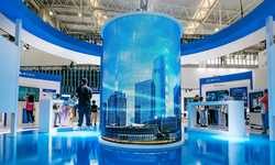
Designing Your Exhibition Stand
DESIGNING YOUR STAND
Thing to Consider in Your Design
The chances are, you are going to spend a great deal of time and effort on the design of your exhibition display stand. The choices you make will shape and structure the experience you create for visitors to your stand, and have a huge impact on the number of passes by who step in.
Some things to remember when you are experimenting with your layout:
Keep it simple
Be bold with your choice of colours
Help visitors experience the benefits of your product or service
DIRECTING TRAFFIC
The way you arrange your space will dictate the through flow of traffic. Even within a small space you can create a cycle or journey that the visitor goes through, which enables you to share you brand experience in a far more effective way - think promenade theatre, and art installation rather than market place and you will immediately be connecting more deeply with your prospective client.
This journey aspect also moves people through, drawing people into your stand, rather than causing congestion at the entrance which can make a stand feel crowded and can put people off.
Decide where to position the guts of your show. The core of your story - if you are doing a product launch for example, your new product would be the guts! Orgainse the rest of your space around this - if you think of ancient temple architecture - you will see that same rules apply.
Do no be frightened of being bold and different in your approach. Segmenting the space can be done through hanging signs, dramatically different lighting set ups, colour, as well as floor markings.
Use signs to make it clear who you are there for... it will help draw prospects who are interested in what you are offering and keep away the time wasters.
OPTICAL ILLUSIONS
If you are really limited for space, the best solution is to you use printed wall panels rather than display stands. Printed panels are brilliant because they are very handy to transport, easy to set up and fix directly on to your shell scheme.
You can further optimise your use of space by what you print on your wall panels. Its time to think like a smart theatre designer and start using ‘forced perspective' images and other optical illusions to create the sense of greater space. Subliminally this will have a huge effect on visitors to your stand.
Think also about images with distinct textures - depending on your brand identity, the use of texture can have huge sensory effect on people and significantly increase the recall factor of your stand. Remember you are trying to engage pleasingly with as many senses as possible. Doing as much of this through your printed walls or banner stands is great value for money.
2D TO 3D
Why not get QR codes to various pages on your website printed on to your panels and transform them from banners stands to portals that will take prospects to your website or landing pages with specific calls to action.
Browse Exhibition Products & Displays
Get In Touch
Need to discuss your exhibition stand, stand design and layout or printed branding? Get in touch via our contact us page to discuss and talk about your project. Our expert Sales & Estimation Team, Graphic Design Team, and Installations Team are all on-hand to provide information and assistance.
View More Case Studies
Posted on February 14th 2011


