Logo Design for Durleigh Gardens
Written by our lead designer Leigh:
Our graphic design team were delighted to work with Durleigh Gardens on a recent logo design. Here's the whole the design process from start to completion.
Having worked with Kier Living frequently over the years on small projects, this was an opportunity to show Creatives full skill set.
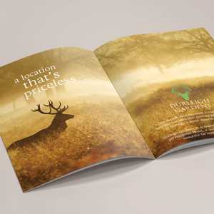
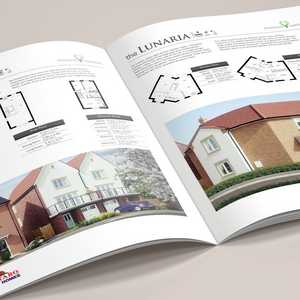
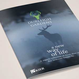
Durleigh Gardens is a new development for which Kier Living required everything from Brand design to signage design through to designing their customer-facing brochures.
My first hurdle was to design the "Durleigh Garden" Brand. This would appear on all the communications for the entire site. As Kier was working with Notaro we also had to design a brand that was pleasing to them also.
I started by researching the area where the housing development was situated. From this, I gauged that the countryside and deer and stags were associated with the name and the area in question.
From this I produced various designs for Kier Living to look at. We then discussed the best ones from this selection, shortlisting four.
I then pitched my prefered option from the shortlist, with a good argument for the case!
From my research and specifically into “Durleigh” I found that the name means: Frequented by deer. Deer/stags are synonymous with quality and stability. So I designed a stag icon and I added plant elements to the antlers to symbolise garden and new beginnings. This is a dynamic and striking design that will be instantly recognisable and will be a great marketing tool. Using classic grey to evoke a traditional and timeless quality. Other colourways include green to represent wildlife/countryside and blue to represent new beginnings and future aspirations. Using a serif font creates a timeless, classic brand which reinforces quality.
This was the first design job produced for Kier Living and the response was extremely positive. So much so we won the opportunity to design all their signs and also more crucially for the studio, the brochure. As this was a chance to show the quality of our graphic design and layout skills.
Managing this project from beginning to end, producing the signage and communication literature, gave us a unique opportunity to show Kier Living our capabilities. So much so that from designing this brochure, we were given older projects (where brochures were already designed) to give them a refresh and redesign.
Which is a great compliment for the studio!
View More Case Studies
Posted by Design Studio on February 14th 2019


