Exhibition Wall Panels Design for Tilstone House
Tilstone House contacted us as they wanted a specific design brief which needed to be transformed in to an exhibition wall design. An image of the Manor House was to be used as the basis of the design, stretching across the back wall of the exhibition as well as the two side walls.
However, the image was not large enough for this purpose, so it was down to us to manipulate the image to ensure it worked on the specified exhibition stand size.
Extending an image such as this can be tricky but luckily mother nature came to our rescue. Extending a building is incredibly difficult and misleading unless in a fictional location. Luckily we only had to extend the grounds and gardens of the image. Creating more grass and trees gives you some artistic license and freedom, allowing you to use the greenery as a pallet and essentially painting on screen.
The first task was to increase the canvas size of the design to the full size of all the walls in the exhibition stand. So effectively creating a flat canvas that consisted of the left side wall - middle back wall - right side wall.
This then gave us the ability to add rules showing the various panel splits and therefore gaging where the corners were for the returns onto the back wall. This allowed us to place the logo in an area that would not be compromised by a right angle return.
Using the feather tool and the cloning tool we managed to create a seamless image that utilised all the exhibition wall space.

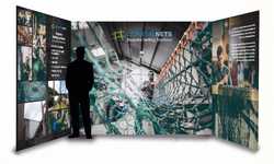
The image above shows a visual of the exhibition stand using the altered image of Tilstone House. Once the client approved the artwork, we printed the exhibition wall panels in-house ready to be used across a range of exhibitions and trade shows.
View More Case Studies
Posted by Design Studio on February 8th 2018


