Logo Design for Durbeyfield House
Written by our lead designer Leigh:
We met with the client on site. Having recently purchased the property/business they were in the middle of renovations.
They wanted to bring the property and business back in line with something more traditional and up market. From the client meeting, we gained an understanding of how they were decorating and furnishing the business and the hotel and bar in general. This gave us an idea on how to pitch the design and give the client design options that were in keeping with their vision.
After taking notes on what items were required. This ranged from new cut letting for the front of the hotel fascia to blackboard and swing signs. One main factor that had to be taken into account was that the Bar within the Durbyfield House had its own identity which also needed to be designed: The QuarterDeck.
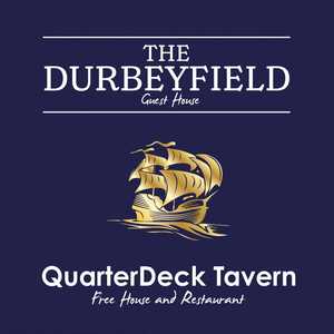
Firstly I started designing the logo for Durbeyfield House. This was the main and key part as this would represent the business as a whole. Once this was approved I then turned my attention to the Bar area "The QuarterDeck". From talking to the client they were keen on using a ship which has been used historically.
I then designed a logo using the "Q" of the "QuarterDeck" as an icon with a ship sailing through, and the sea creating the tail of the "Q" letter. I designed various ship icons for the client and I recommended my chosen design. Although I thought this was one of my favourite logo designs for a public house, alas it was not to be. The client decided that a different typeface was needed and to have the ship as a separate entity and to only be present on the swing sign.
Although my vision and designs were not used in my opinion to their full potential, what we have designed has refreshed and rejuvenated.
View More Case Studies
Posted by Design Studio on July 19th 2018


